A new B2B onboarding experience - "no-touch"
anybill (www.anybill.de/en), a SaaS provider for digital receipts, wants its small and medium-sized customers to independently take advantage of its services for digital receipt issuance in retail and gastronomy without the help of sales representatives. Therefore, the company's public website and the related onboarding forms were recently updated.
Now, anybill's product team wants to empirically validate whether the UI changes were effective in terms of user-friendliness and information quality. A lean qualitative study, described below, provides the desired evidence and insights for direct actionable optimizations.
Background
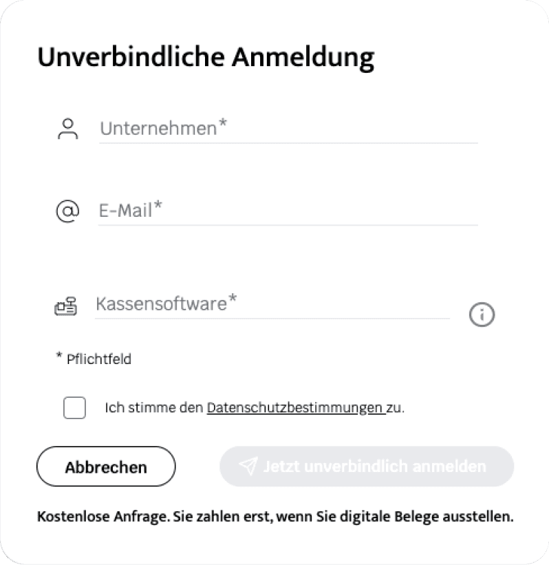
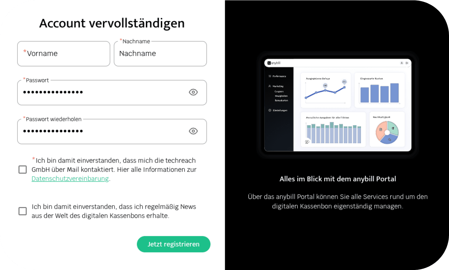
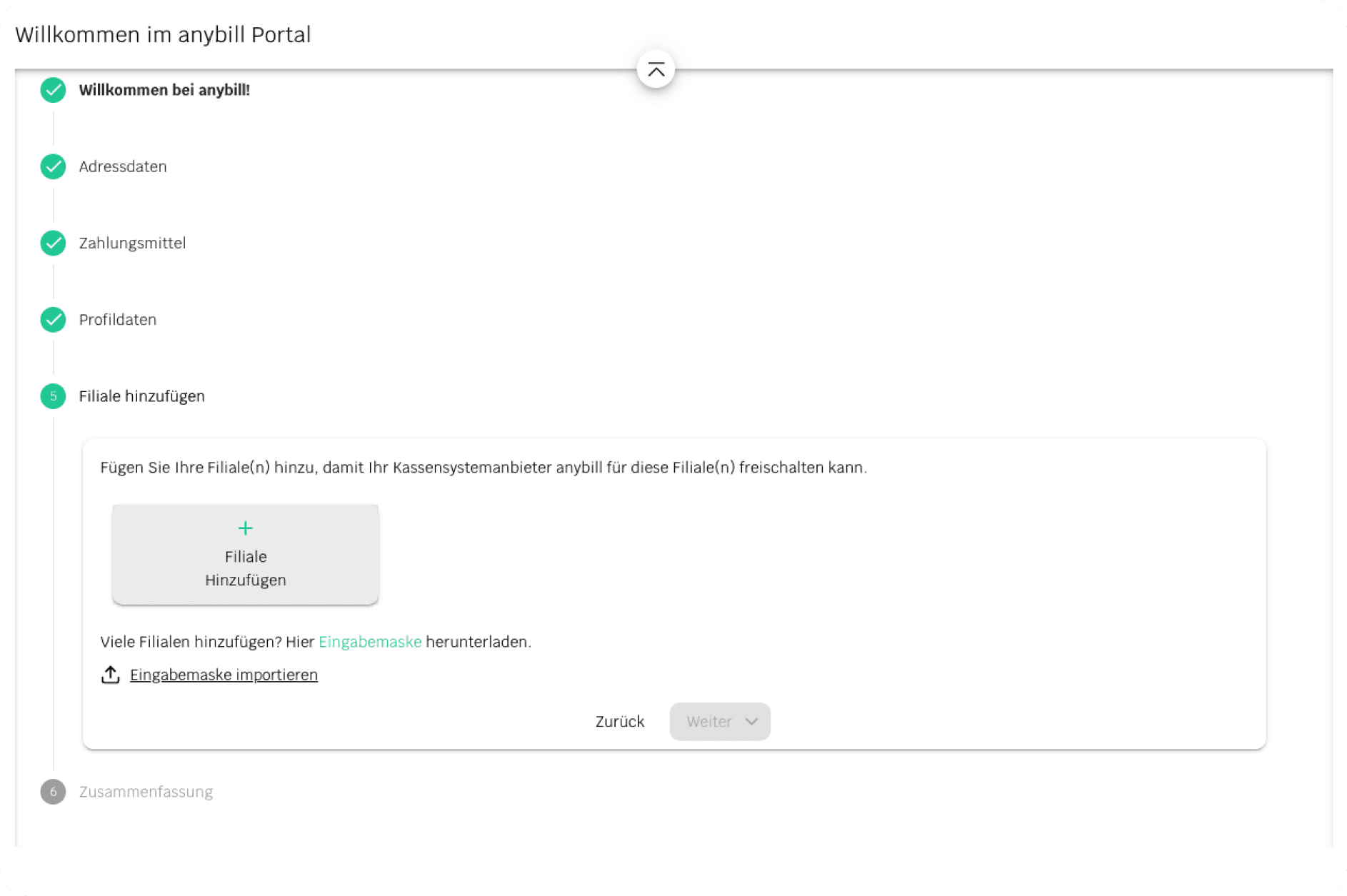
The project focused on the recent changes to the landing page of the website and the subsequent onboarding funnel, which consists of three parts in total:

Figure 1. Non-binding application: minimal complexity to quickly engage the user.

Figure 2. Registration: setting up a username and password.

Figure 3. "Entrance Flow": stepper for subsequent input of all necessary information.
Goals
For the first time, analyze real user behavior with the most business-relevant user flows, as the company had not conducted such user research in this area before.
Understand how users initially perceive the landing page of the website and how they identify the key information relevant to them on their way to conversion.
Collect initial feedback on the new step-by-step onboarding flow and derive specific improvements for low-level design and wording.
Method
Moderated remote usability tests (MS Teams and phone calls)
Predefined specific user tasks
Thinking Aloud during all tasks
Semi-structured interview (intermittent and summative questions)
Participants
n = 10 (7 male, 3 female)
Age range: 35 - 65 years
Location: Nationwide
Retailers and gastronomes
Insights
Website:
All participants were able to find the relevant information for them without assistance from the interviewer.
Customer portal onboarding stepper:
All participants aimed to sign up independently, and they achieved this without assistance and without major issues.
Specific feedback was collected on...
visual aspects (layout, colors, contrasts, spacing, buttons, font sizes),
interaction quality (information architecture, findability, affordances), and
wording (language style, information density, length of text passages)
Conclusions
Successful validation of user-friendliness: landing page of the website
Overall, the website allows for intuitive and smooth exploration, and at least the examined target group does not miss any important information. The qualitative results allow for targeted optimizations within the design in accordance with the derived recommendations.
Successful validation of user-friendliness: portal stepper
The portal's entrance flow is self-explanatory and guides users through the process without overwhelming them.
Limitations
Sample size and scope: Due to recruitment constraints (time, personnel), some participants were recruited from the company's acquaintances. In addition, only a few existing customers were interviewed. Therefore, there may have been a certain positive bias in the qualitative feedback, and some users lacked content-related naivety (e.g., prior knowledge about the website's content).
Limited time frame per test session: Since there was no significant participant compensation (and the target group were all full-time entrepreneurs or managers), the participants could not be interviewed as extensively as the chosen research methods ideally would have required. Therefore, some sessions were shortened, and some were conducted by phone instead of screen sharing. This could have affected the quality and quantity of the insights.
